

Northern Bites
Brand Development / Graphic Design / UI + UX / Photography
From humble beginnings eighteen years ago, to a food-to-go brand that the North can be proud to call it’s own. They came to us with a bold new name, a grand vision, and in need of a brand identity that would see them continue their growth over the next eighteen.

The Identity
To match their down-to-earth Northern values, sits a new logo free from pretentious adornment, and full of craft and character. With a woodcut typeface, and a simple compass icon inside the O, we created a brand system that’s as honest as they are. With a monogram version for smaller spaces to boot.

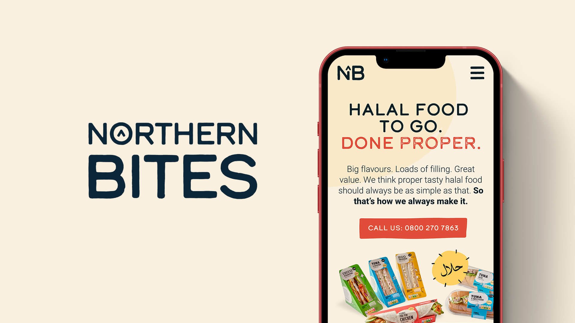
Provenance + Quality
The website takes its cues from the packaging, with bold colour blocking, organic shapes, and charming illustrations that speak of the provenance and quality of the ingredients.


Photography + Rollout
And to get the brand ready for relaunch, we shot all new product photography, and designed uniforms, liveries, stationery, and more. So inside and out, the world of food-to-go just got a little bit more Northern.