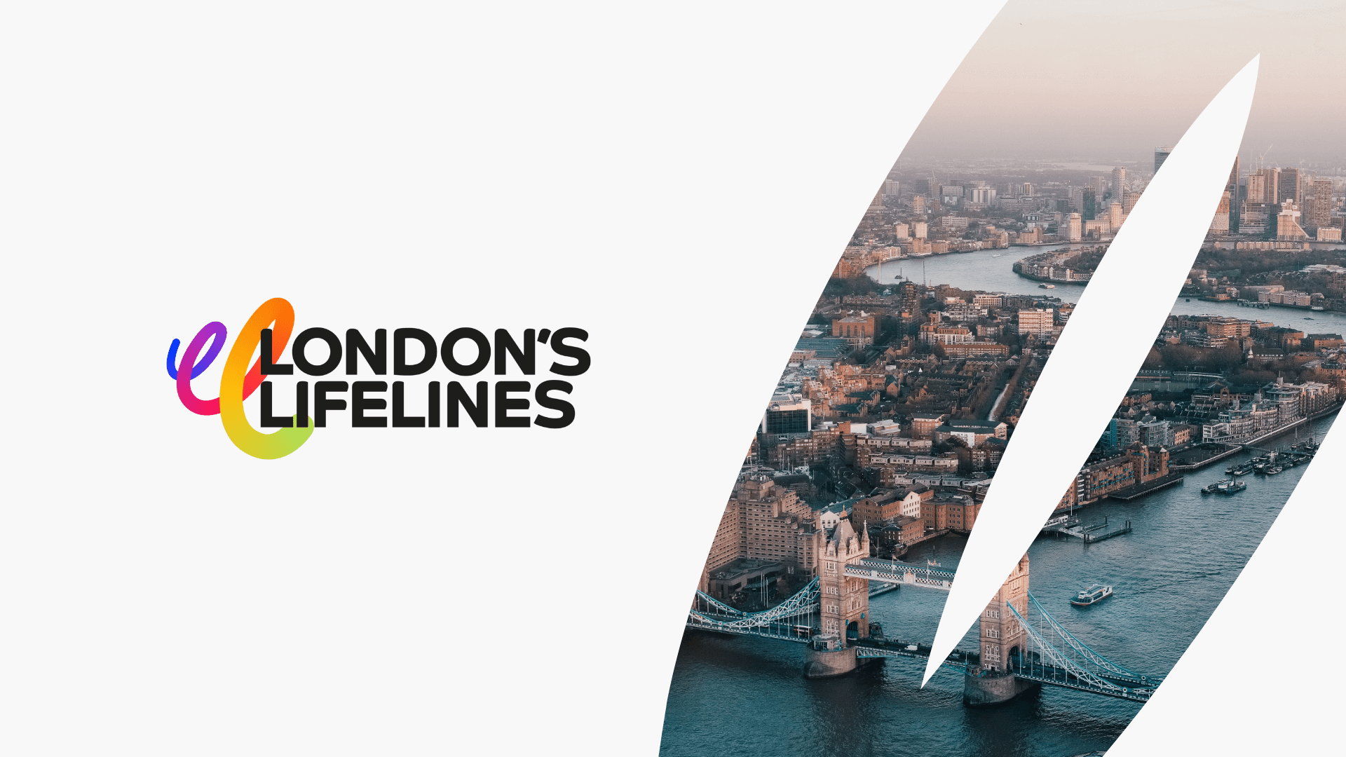
London’s Lifelines
Visual identity / Creative Direction
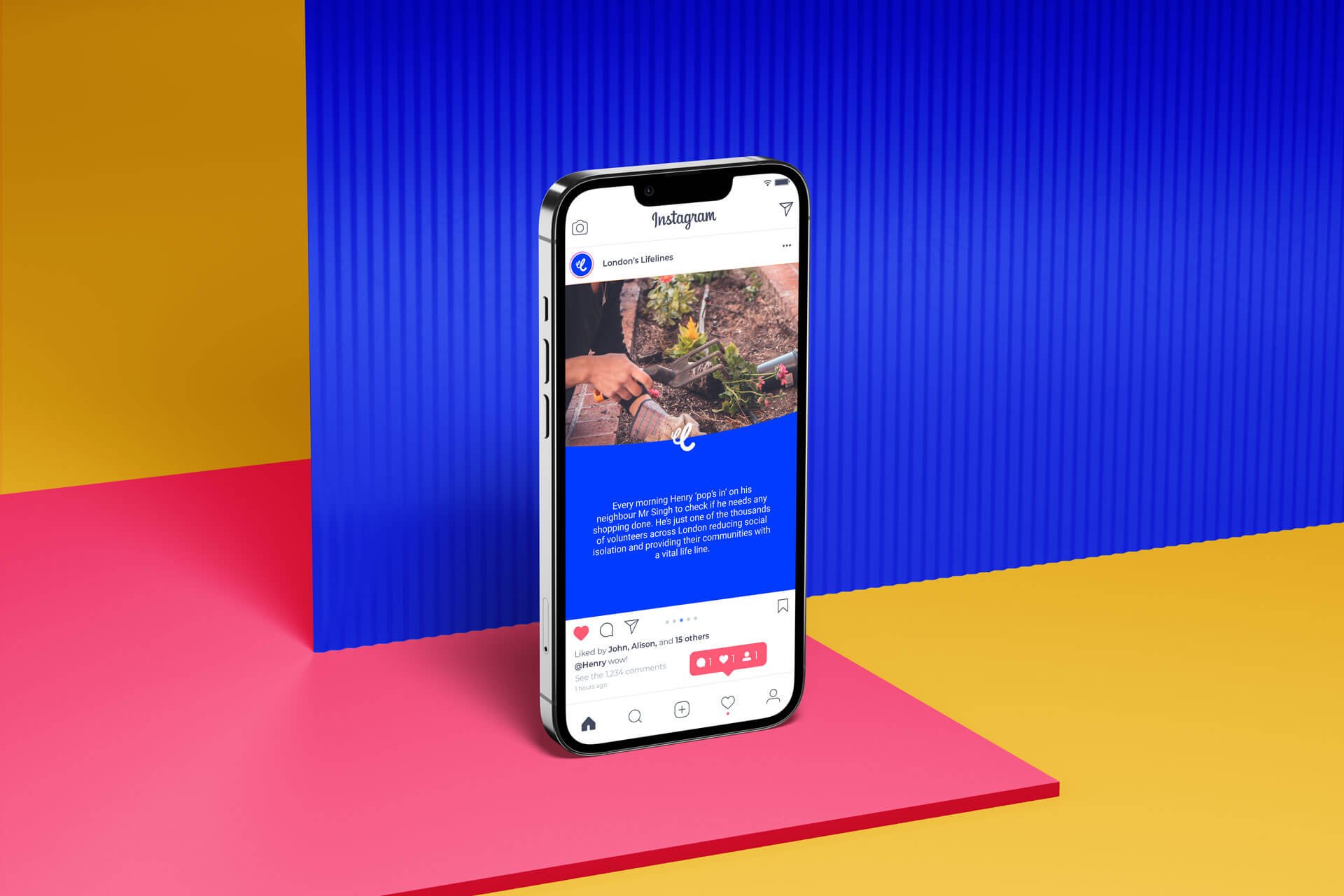
The London’s Lifelines campaign aims to shine a light on the power of volunteering in London and raise awareness of how volunteers have powered the city’s economy and vital services. And a visual identity was needed to reflect the diverse community of volunteers, and the positive impact they have.
Fluidity + diversity
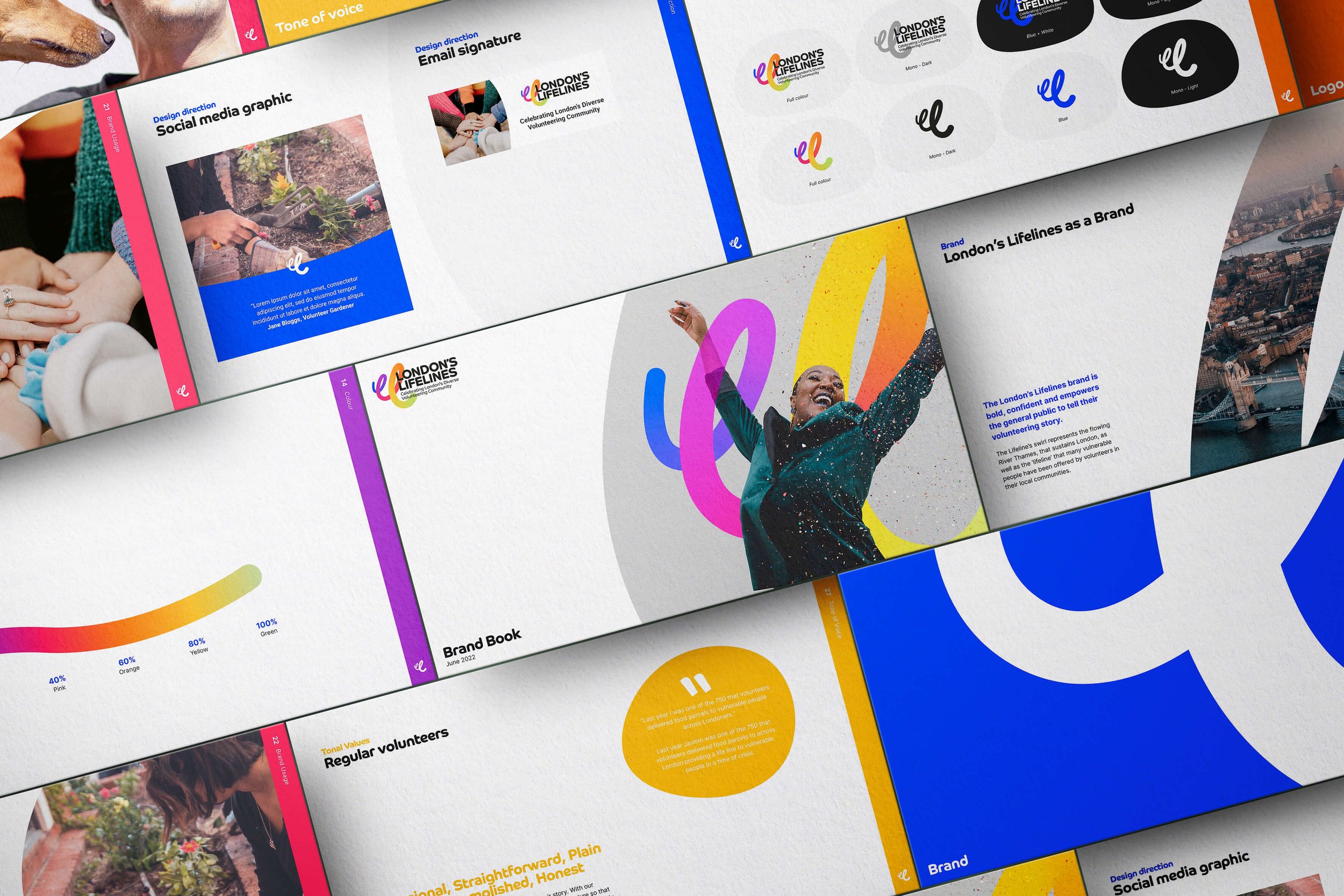
The developed identity needed to reflect the core values of the campaign: Bold & Brave, Celebratory, Warm & Friendly. The fluid logo mark reflects the impact community volunteers have on London as a community and the gradient reflects the diverse community at it’s heart.

A colourful community
The vibrant colour scheme underpinning the identity brings life to the campaign and is inspired by the diversity of London. In isolation the colours are used to grab attention and balance the community based photography. And can also be used to categorise content into different aspects of volunteering.