


Castle MacLellan
Brand Development / Packaging Design
The original luxury pate. Slow to change, they fell by the wayside, and needed a radical overhaul to bring the luxury and prestige back to this famous Scottish brand.

Dated history
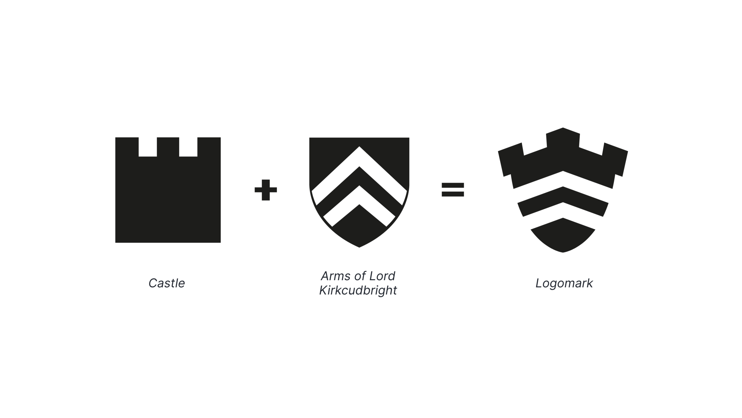
The existing logo was awkward, dated, and difficult to use. The new identity elegantly pairs a castle motif, with the Arms of Lord Kirkcudbright —bringing the town where the product is manufactured, to the heart of the product.
The finished identity pairs the shield logo mark with the Celtic inspired typography to create a brand identity that feels historic, premium, and distinctly Scottish. The subtle shading on the logo mark adds perspective and further enhances the recognition of castle ramparts.


Illustrations
To improve flavour variant visibility on pack, we introduced illustrative elements, and colour coded the flavours much more clearly. The illustrative style selected was a wood block-esque approach, that would further add to the historic feel of the packaging, and differentiate them from other products who favoured photographs of pate - which can be unappealing and look similar to one another.
The Packs
The finished packaging is bold, premium, and stands out on shelf. The illustrations are paired with a bold colour blocking for each flavour to ensure products can be easily picked out at a glance.