

Why you should consider web accessibility as part of the branding process

It’s easy to fall into the trap that web accessibility is only important for certain organisations, or that browsers of today do all the hard work for you. I was in a meeting a few years ago where a business owner said, and I paraphrase, that they didn’t consider following the Web Content Accessibility Guidelines (WCAG) standards important as their products weren’t being bought by people with disabilities. I couldn’t tell you if that was actually the case but the odds are that it wasn’t, with 15% of the world’s population living with some form of disability. By not taking steps to be inclusive with your brand and website, you run the risk of alienating a much larger audience and damaging your reputation.
What’s this got to do with the branding process?
So if web accessibility is all about making sure your website is designed and built to meet the WCAG standards, what does this have to do with the branding process? It’s simple, and it comes down to values, colour, and language.
Values
All good brands have strong core values that they use to guide them. Whether it’s to offer the highest quality products, or to change the world in their own unique way, company values come in all manner of forms. I think we can say most businesses consider themselves inclusive, but how many embody it as a core value?
So if you’re starting out or are an established business, consider your values and whether they are promoting inclusivity as part of your everyday operations. Not only will it make the decision to make your website accessible easy, it will also trickle inwards, developing a company culture that is respectful, diverse, and more conscious in its actions.
Colour
One of the ‘quick’ wins to make your website accessible is to ensure the colours used, have sufficient contrast between each other. This simple change allows those with visual impairments to better read text, and better find their way through your website, and ultimately make a purchase or complete the task at hand.
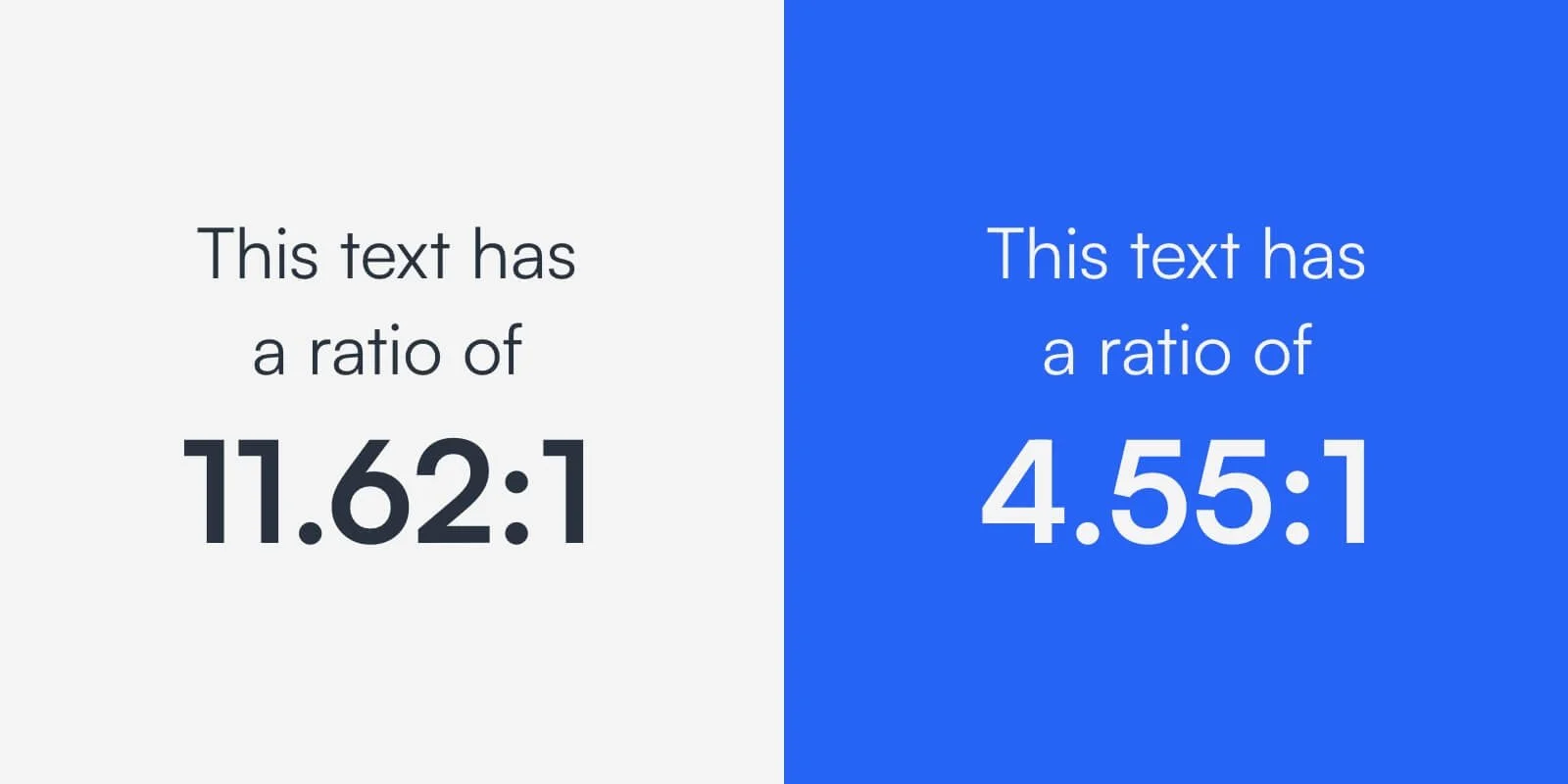
The standards require, as a minimum, a contrast ratio between colours of 4.5:1 but suggest 7:1 where possible. This is for text smaller than 24px, but for text larger than this the ratios drop to 3:1 and 4.5:1 respectively.
So as you can see, selecting the right colours can have a large impact on whether your site is accessible, and that leads us onto the problem. A lot of companies don’t consider these ratios when designing their brand. Only to find that in order to make their website accessible they have to modify their brand colours, thus diluting the consistency of the brand they spent time and money creating. For that reason, we always look at accessibility when designing brands ensuring there is enough flexibility within the colour palette to achieve accessibility goals, and develop a visually appealing and appropriate logo for the business and audience.
If you’d like to check your brand colours and website accessibility here’s a couple of handy links to do so:
Language
Perhaps the hardest consideration to check is language. Not all disabilities are physical and it’s important to consider the impact of your tone of voice. This includes writing concisely, cutting out jargon, and simplifying the words used to allow audiences of all reading levels to understand your message. And this is where the tone of voice of your brand comes in. All good branding processes should include a tone of voice document that outlines how your brand speaks. The benefits of this is that everything you put out will sound consistently like you, but it also gives you the chance to add rules around accessibility. These could include cutting down on jargon, avoiding long sentences, and using an active voice. So when it comes to writing your website copy, not only will your message be clearer, it will be easier to understand for a wider range of potential customers.
In Conclusion
It’s easy to assume that web accessibility starts and ends with your website, but if you consider it from the get-go you’ll avoid having to make changes to your brand at a later date. And in an age where audiences are seeking out brands and businesses that align with their values, you’re showing you care about more than just a quick sale.
If you’d like a free accessibility review of your website, or help in ensuring your brand is accessible from the start. Get in touch to find out more.